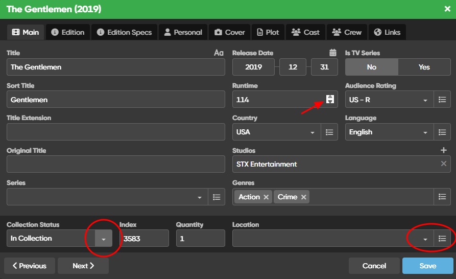
Would it be possible to increase the size of the up/down arrows of the number form inputs (such as Runtime), please? I find them a bit difficult to click on. It would be nice if they would fill the entire height of the input field. I think they would also look better if they matched the styling of the dropdown toggle buttons. See image below.
Also, I like the effect that your dropdown toggle buttons have on hover. But I notice that when they’re adjacent to a manage button, they lose the styling and hover effect. I think it would look better and more consistent if all dropdown toggles were styled the same and had the same hover effects. I think a similar hover effect over the manage button would look nice too.
The up/down button should indeed be bigger. I’ve written it up as a bug.
As for the dropdown button: the reason for this is that the “Collection Status” is a “set field” - you can not add your own typed in collection statuses.
Pick list fields such as Series or Location you can use the dropdown, just type, or pick from a list, clicking that list button on the right.
When typing, it should also automatically try to help you find your item you want to pick.
I agree that for a user they might feel like “they do the same thing” - open a dropdown, but the field type is different. Will think modifying either of those field types so they look the same
Thanks @CLZ_AJ ! I can see what you mean about the difference in function between the two field types. Even if you were to keep the styling as is to emphasize that difference, I think it might be nice to have a hover effect over the dropdown button and the manage button. But it’s just a suggestion. They certainly work just fine as is! Thanks for all the great work y’all are doing!