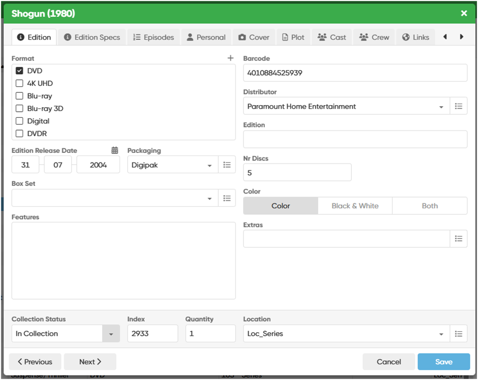
When editing an Item which is Series, the Edit Window with the tabs (Main, Edition, etc ,…) is not large enought to display all the tabs at once (also I’m using an 1920x1080 screen). The display of the Tab Episodes makes all the Tabs scroll to the right when I edit for example Personal Data. And afterwards If I want to go back to the Tab Main, I need to use the Arrows first (very confusing). As I never use the Links Tab, I would prefer the Tabs on top not to scroll automatically. If I want to go to the Links Tab, I could then always use the right arrow.
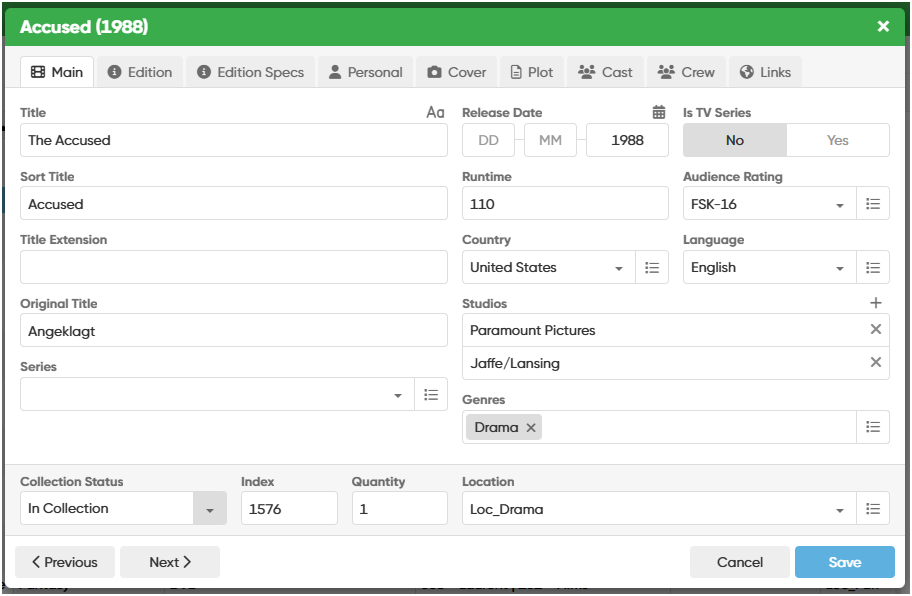
Here are 2 examples, the first beeing a Series with the Main Tab not displayed.
Thank you for adjusting the edit windows dimensions. I must confess that it took me a good 15 minutes to detect that I could scroll to the left by using the arrows on the right! I first thought this was a bug, so I simply closedcthe window and opened it again to find my Main Tab.
Great, this one really simplifies my life I found out that while editing I’m switching most of the time between the Main Tab (because of the Genre field) and the Personal Tab (for obvious reasons). And scrolling to the Links Tab is now quite intuitive with the right arrow located on the right side. A great many thanks for this one.