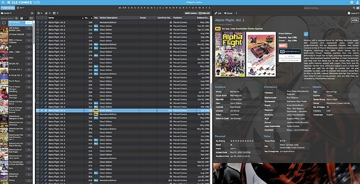
The toggle between front and back covers seems to be disabled and now both covers show on a comic. I don’t see anything in settings to enable the toggle, so I thought I’d report this.
You might wanna check the “What’s New” page for CLZ Comics Web:
https://clz.com/comics/web/whatsnew/2025/05/27/more-compact-design-and-layout-fit-more-comics-on-screen
We just released this new version on Web, and one of the improvements was:
Improved comic details panel
- Slightly more compact design, to fit the new look of the software
- Improved layout and field placement
- Better support for back covers:
- Switch between front and back using the “bullets” below the cover
- Now automatically shows front and back cover side by side when there is enough space
If you make your details panel less wide, you will only see the front cover and little bullets below them to switch between front and back.
But again: if it fits, then the back cover will automatically display next to it to make optimal use of the space available.
Well…how do I make my details panel less wide? I think always displaying the back cover which 99% of the time is just an advertisement looks awful. I get including the back cover on comics for wraparound covers and occasionally identification purposes on certain comics that why I preferred the toggle option that was previously used.
Maybe I’m in the minority here, but I think always showing the back cover is an awful design choice that adds little value to most comics.
No worries! We talked about this being a possible complaint, as indeed the back cover is often a “commercial”. I feel “awful design choice” to be a bit much - ![]() . We felt like pushing the feature live for all 5 apps and then decide to add options later would be a good choice - and we already thought most likely we were going to add options for it. Later.
. We felt like pushing the feature live for all 5 apps and then decide to add options later would be a good choice - and we already thought most likely we were going to add options for it. Later.
So the possible options we have been discussing internally are:
Have Settings > Checkboxes for:
- always hide back cover under “toggle bubbles” (a little bit like it used to be)
- always try to show back cover if “wraparound” cover (and have the back cover on the left side, so it actually WRAPS

it is likely that something like the above will make it to the software soon, and its good that you point out that you don’t like how it is right now.
I see that you are not using the details panel “in your main screen”.
You have your details panel on a secondary screen. In that case you can’t make it smaller indeed.
If you want to TRY it for now, you can do so by changing the LAYOUT:
I can fully understand that you do not like to always see the backcovers. As AJ indicated above, we expected this feedback from a small minority of users and were already expecting and planning to make the display of back cover OPTIONAL, through a Setting.
To call this “an awful design choice” is a bit brutal though. This change was made after years and years of complaints from users (mostly users coming from the desktop software) about the Web software NOT showing the back covers.
So with this redesign, we FIXED that, we finally gave in to the complaints and created a cool design that shows BOTH the front and back cover, without having to click a “Flip” icon.
Also, the problem on your end is made worse by your usage of the old “No Details” layout. Which IMO is a in the pain in the ass, as you are always clicking back and forth between the collection list and the comic details page.
I would strongly recommend to to try the Vertical Split layout. That annihilates the back and forth clicking by integrating the comic details as a panel within the main screen. AND it hides the back cover too, returning to a nice toggle between front and back (the bullets below the cover).
Here’s a screenshot of your account in Vertical Split mode. See how cool that is?
I’ll concede that calling the back cover an awful design choice was a bit harsh…I guess jarring is the better way to put it, especially when I prefer the toggle option.
I definitely prefer the toggle method as I rarely need to see the back cover. I’ll try the split screen, but I didn’t really care for it when I switched over to the web version because I felt like it was too busy. I also disable the background image because I prefer a slick, cleaner look. But I’ll give it another try.
And speaking of the cover images. Has there been any thought of increasing the size of the cover image? I know you can click on it for full size, but I’d prefer the image to be full size without the click, rather than showing the back cover image.
My reasoning for the larger front cover image is for uploaded custom covers. Say I have two copies of the same issue in slightly different grades. Having a larger image would allow me to better see which copy is which by spotting the defects that put it in that grade. That’s just a practical use example, but just having the front cover display more prominently would be cooler.
Thanks for listening. I know you have a lot of users to appease, and it’s not easy to please everyone.
I agree with @pkuneman A toggle to turn the back covers off would be awesome. It’s nice to have a back cover available for verification but I have only needed to do that maybe twice. I use the vertical split and the back covers still show for me.
I just moved from Desktop to the web version. It would be nice to toggle off back covers
Yes, it is on our feature request list!
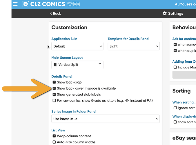
We’ve just released a small update for CLZ Web where you can now disable the automatic showing of back cover (and always use the “toggle”).
Open the menu top left
Click Settings,
Then under “Customization” you can now uncheck the “Show back cover if space is available”.
Let me know what you think!
Awesome and thanks
Works great!!! Thank you for adding this.
What did that mean? Are we saying you can spread CLZ out between two screens?
@glennsimpson No, bad choice of words I guess. So here’s what I meant: you have an option to hide the details panel from the main screen, if you do that, you have to click a movie and it opens full screen to show details.
To see the list again, you’d have to hit “back”.
We usually advise (and prefer) to use Horizontal or Vertical Split.
The button to play around with this is called LAYOUT and sits top right of your details panel


