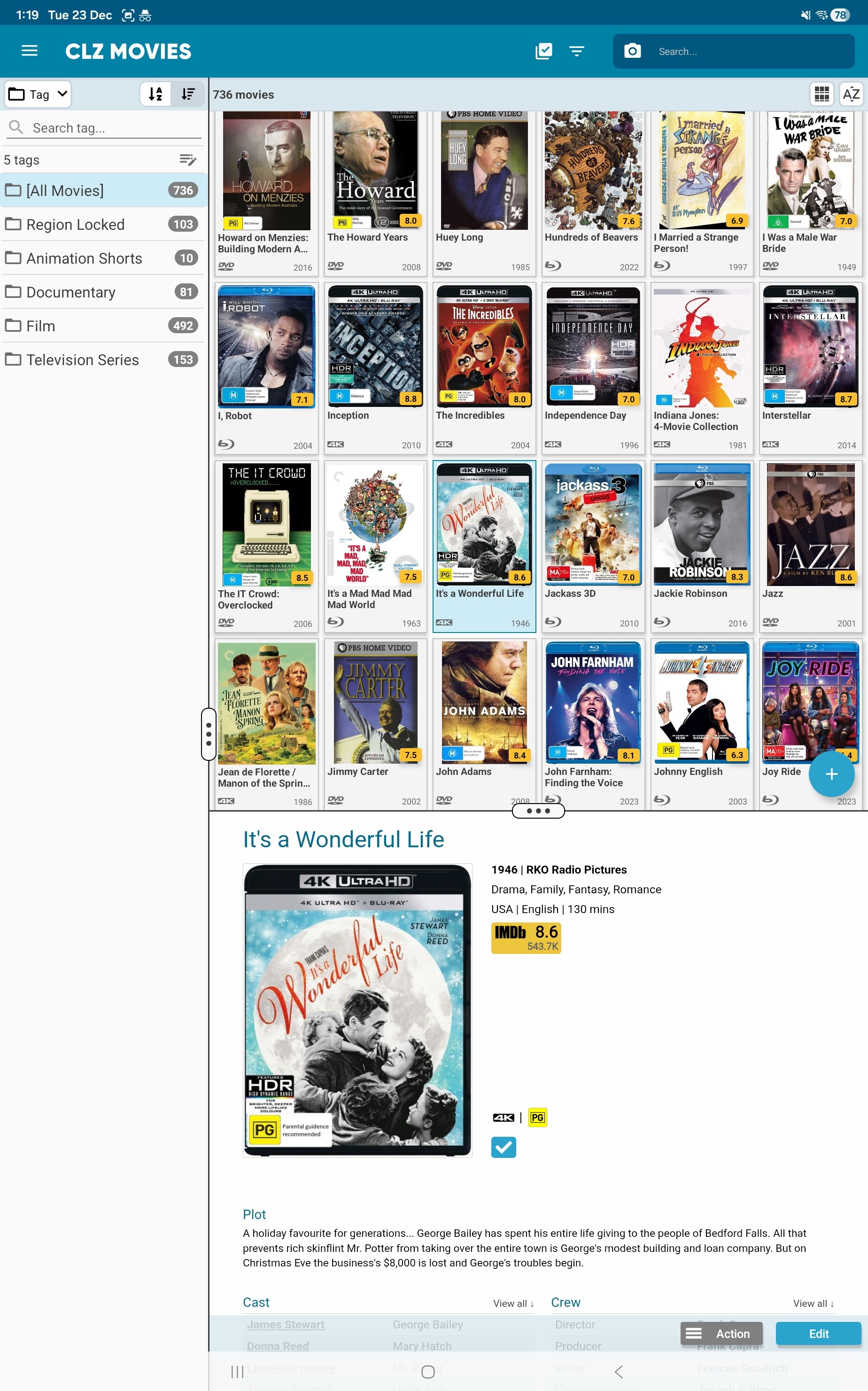
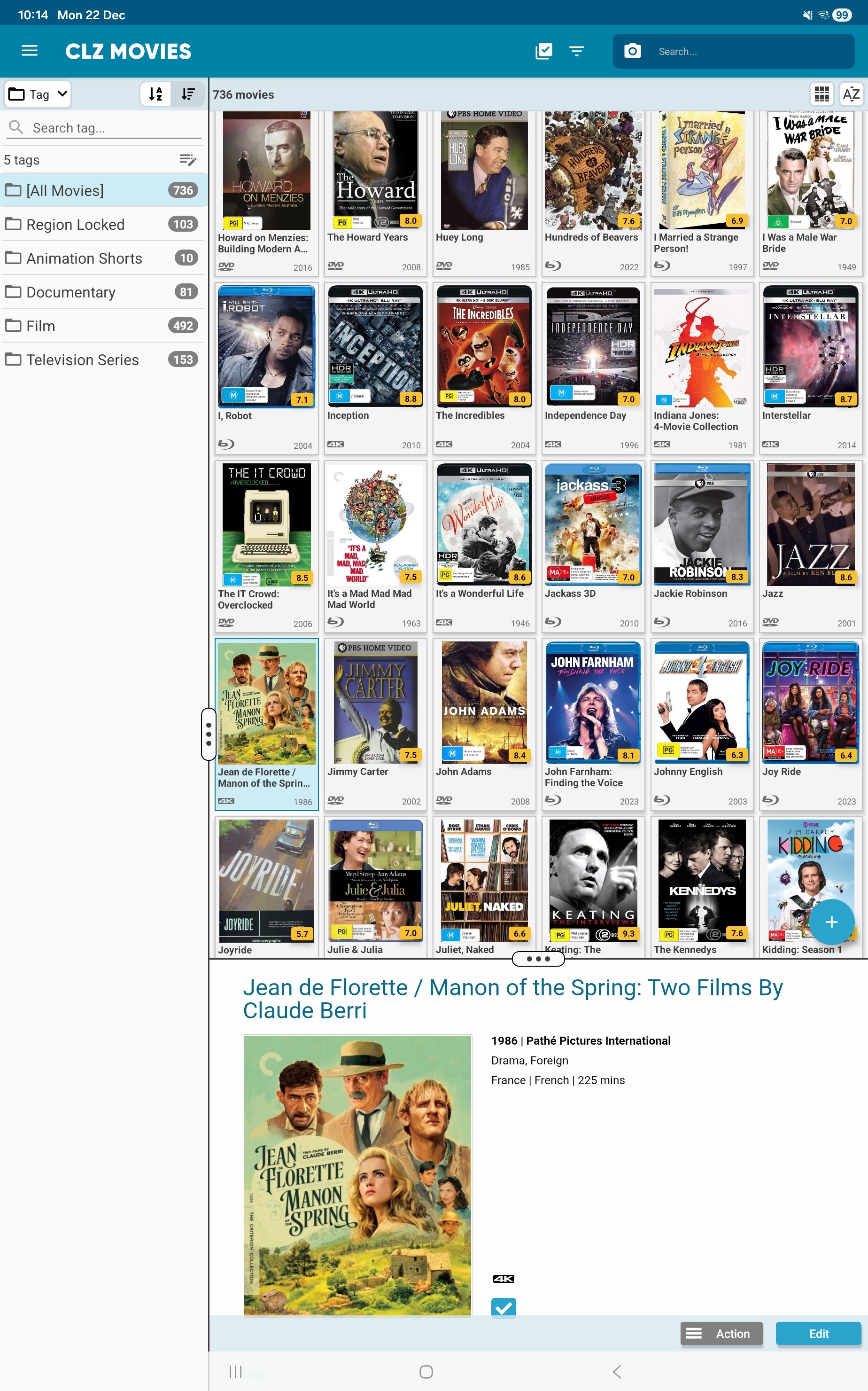
There’s quite a large blank space in detail view between the IMDb rating and the format, watched, etc icons below it. Is this a bug or have a left a field blank that would normally take up this area?
That is a bug, it only happens if there is a back cover available. We’ll work on a fix. Thanks for reporting this.
Hi, this bug seems to be still occurring and not limited to entries that have back covers. Screenshot attached.
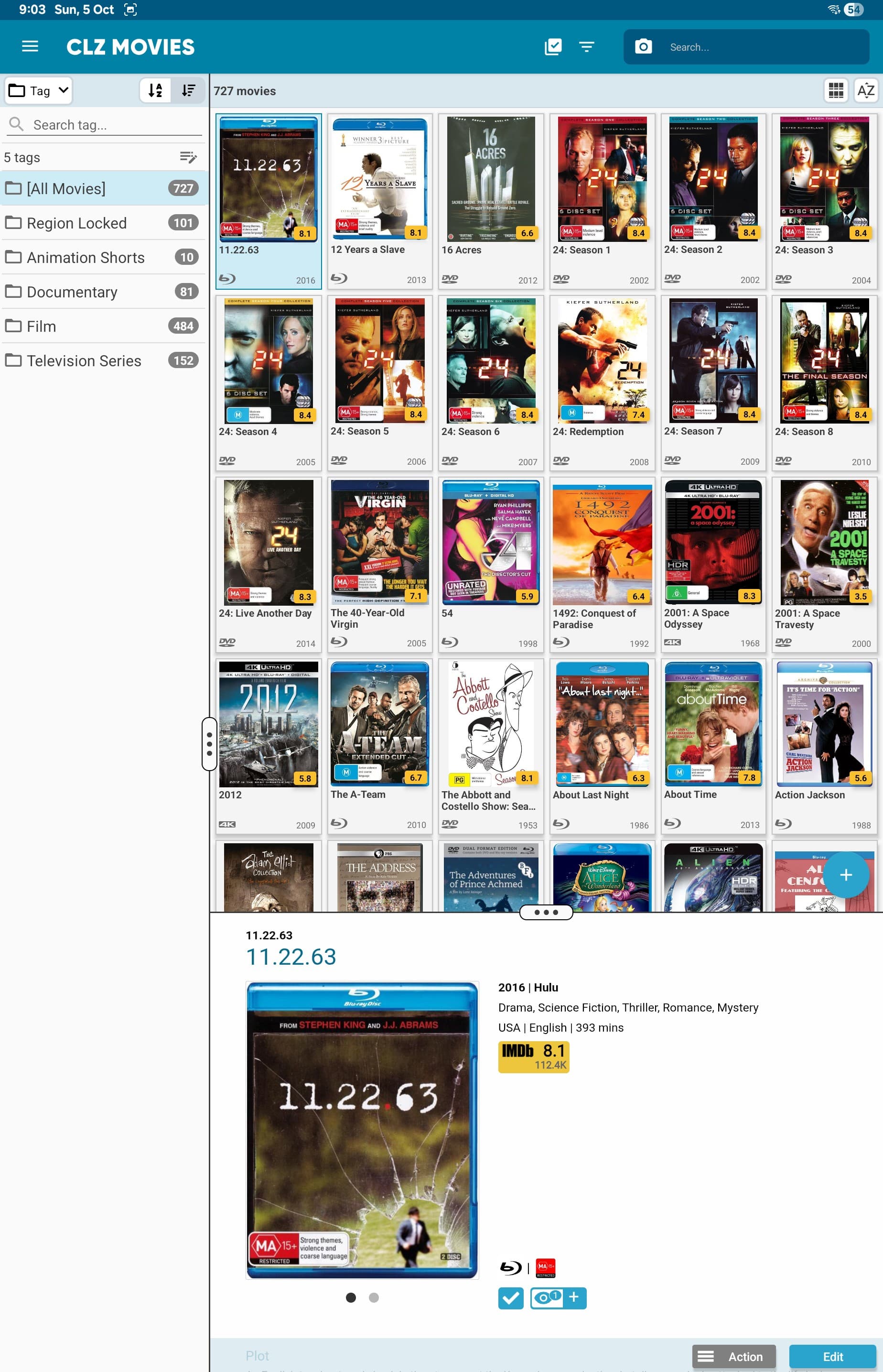
The format icon, and the in collection status icon, and the “seen it” button should align with the bottom of the cover. That is how we intended it.
Is that not working for you? (in your screenshot I can’t see that exactly, it seems to be aligned correctly there)
I suppose they seem aligned as they are at the bottom of the cover, albeit in two lines. It’s more the large white space between those icons and the imdb rating icon which has led me to believe it’s a possible formatting but. I assumed that white space wasn’t meant to be there and that would allow the plot details to be moved up to align to the right of the cover. Included another screenshot, please let me know if that is how it’s meant to look.