To prevent RSI as much as possible I try to use my keyboard as much as possible when entering specs. This is a bit annoying when this happens (I enabled tab indexes from the accessibility screen so I could see if there was a problem with the tab index):
I can start at Title (tab 704 in this example). I can go to Series (708), but I cannot go to 709 (Release Year).
I don’t see where the tab index continues.
When I start in 708 I can continue:
Same issue for the other screens:
Luckily I am not a blind person, so it is no issue for me that the tab index in the popup starts above in my example. When I set my cursor in the first field I like to use my keyboard to go the next field.
I created other topics in the past regarding the use of the mouse when entering data. Would be nice if you improve the application when using the keyboard. I cannot imagine I am the only one. If you compare it with how well the keyboards work with the Desktop application:
If you first select the Series field and then hit Tab it goes to Release Date, but if you start at Original Title I cannot reach Release Date with Tab or multiple Tabs. At least in firefox this does not work. I can hit Tab a hundred times but it will never reach Release Date. I think another requirement is that there must be Series to choose from. I think it only happens when the dropdown is popping up. I think it worked only once when the Series where not loaded yet.
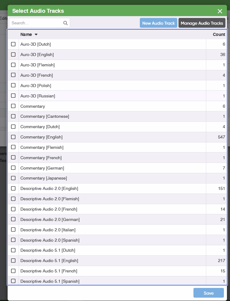
3 My list of audio tracks is quite long. So using the arrow keys to go through the list is not the fastest way to enter data. Only Home/End keys work to go to the start or the end of the list. I would like to go faster through the list.
Up/Down is way to slow to go though the whole list.
Page Up/Down scrolls the list, but not the selection. Page Up/Down would be faster to go through the list.
Alternative that is annoying to do (I tried to see if this would speed things up):
Home
Shift + Tab 3 times to go to the Search field
Enter a search term like DTS or English
Tab 3 Times to go to the first selection
Make selection
Go through this steps again for the next one
What would be absolutely the fastest way to go through the list is if you could type in this list.
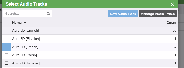
Blue selection like in the screenshot above
Then I would like to type: DTS
Then the selection should move to the first element which starts with DTS
Not sure but I think Page Up/Down would be good enough and fast enough
4 I don’t like the behavior for checkbox selections. For example the Region field. If I want to select Region A, B and C with the keyboard I have to do:
Use arrow down x times to go to Region A (okay)
Spacebar to select (okay)
now selection is moved to the first element (annoying)
Use arrow down x times to go to Region B (annoying)
etc
I would like to go down in the list once, make selection, go down once, make next selection with spacebar, go down once and select the third.
That is quite some feedback, but I was happy to see you like the improvement already. It’s too hot here now to go through them.. so I’m postponing reading it all until it cools down a bit (you’re in the Netherlands too right… phew).


 )
)