When grouping by folders the layout of the cards look a little bit off, the spacing between the second and third column is bigger and the top right card is slightly larger than the rest.
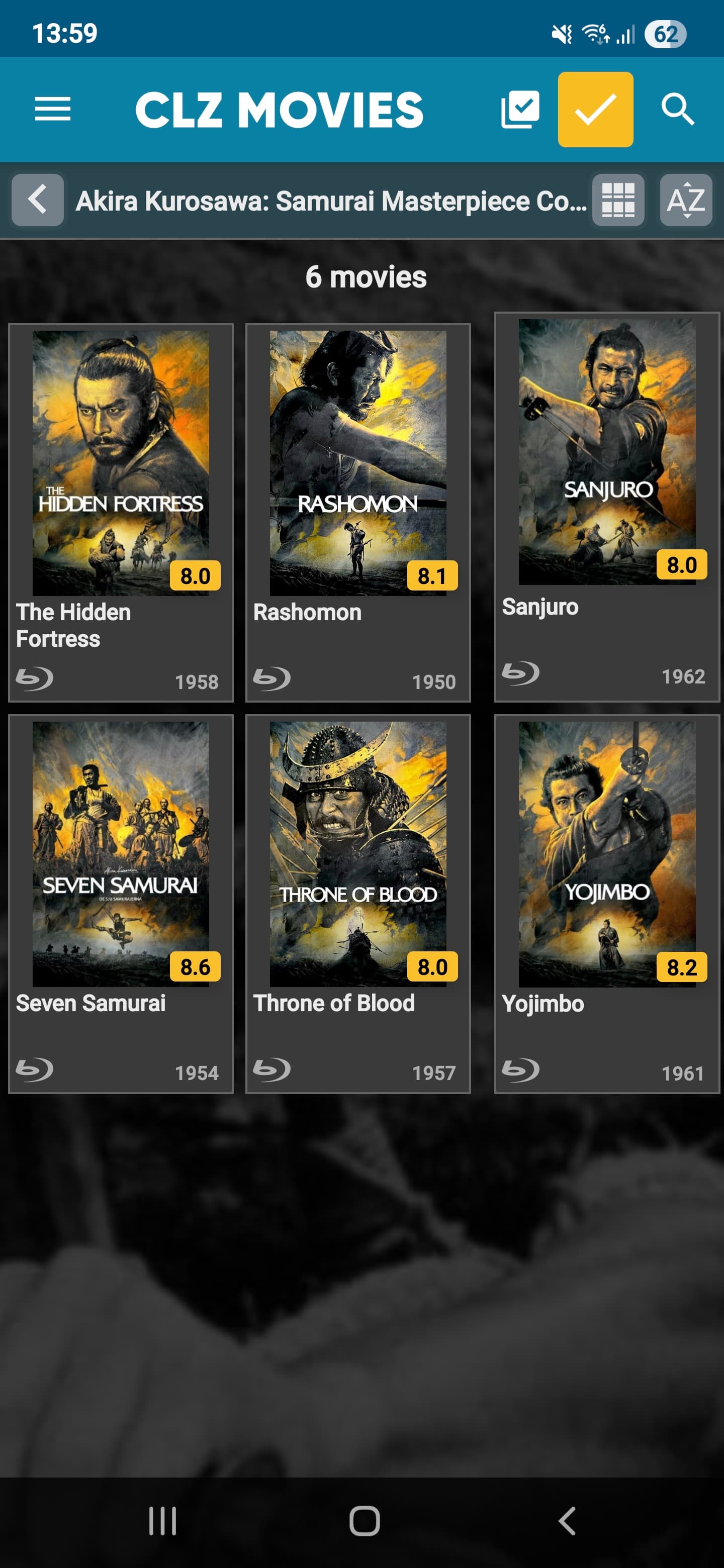
By selecting a movie to go to the details page and then return by pressing the back button the layout of the cards look as it should.
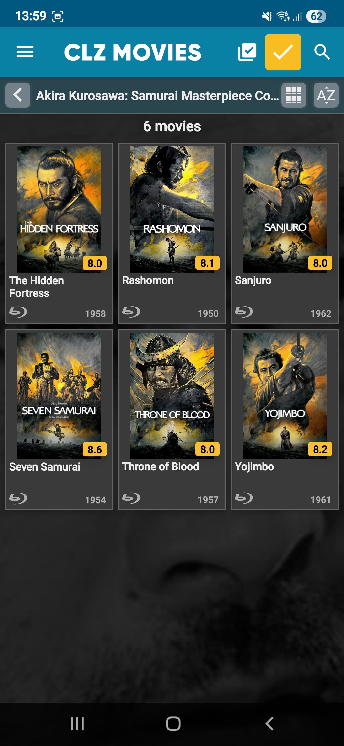
If I now press the back button and then select another folder the layout once again look off.
Can you reproduce this behaviour on your end? (I’m on Android)